
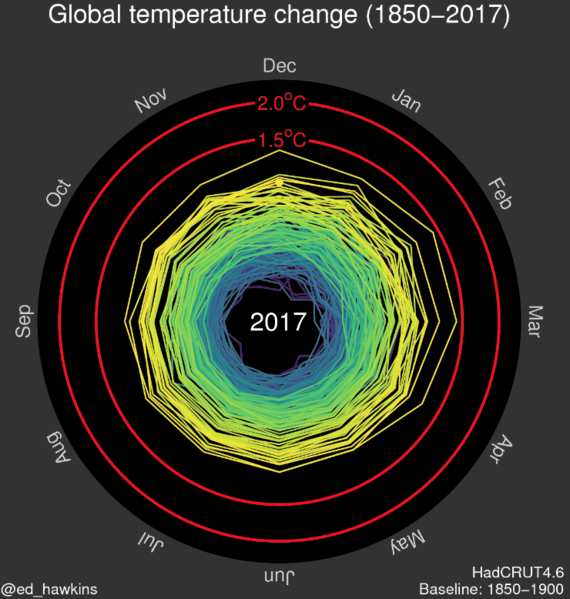
Ed Hawkins of the National Centre for Atmospheric Science has developed animated climate spirals as a different way to show the historically observed climate changes.
www.climate-lab-book.ac.uk/spirals/
There is a video visualisation of these from the Hay Festival & NERC entitled “Weather Watching Like a Circle like a Spiral”
www.youtube.com/watch?v=dBv9dFTPCFU&list=PLucAMf26tYbHKLMECyKqidrGB6jIXHOeN&index=5
These climate spirals were precursors to Ed’s Climate Stripes.
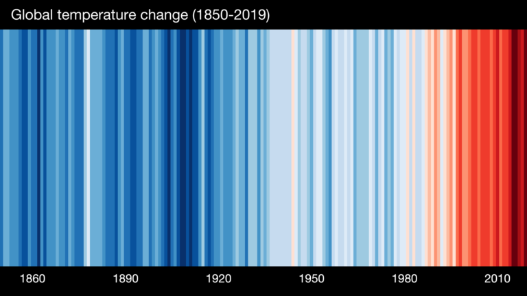
These ‘warming stripe’ graphics are visual representations of the change in temperature as measured in each country over the past 100+ years. Each stripe represents the temperature in that country averaged over a year. For most countries, the stripes start in the year 1901 and finish in 2019. For the ocean basins and for several countries with longer datasets available the stripes start in the 19th century instead. For two cities (Stockholm and Vienna), the data starts in the 18th century.
For virtually every country or region, the stripes turn from mainly blue to mainly red in more recent years, illustrating the rise in average temperatures in that country. These “warming stripes” are now available for 160 of our 244 regularly analyzed cities.
Why not download the stripes for your own City/country/state and show them as part of a workshop?
You could show the graphics before explaining what they show and ask your participants to guess. The colours are likely to be something they associate with temperature already.
Ask your group to make something with the climate stripes for their country/region, such as a scarf or paintings. You can download the graphics at: showyourstripes.info/